 Resume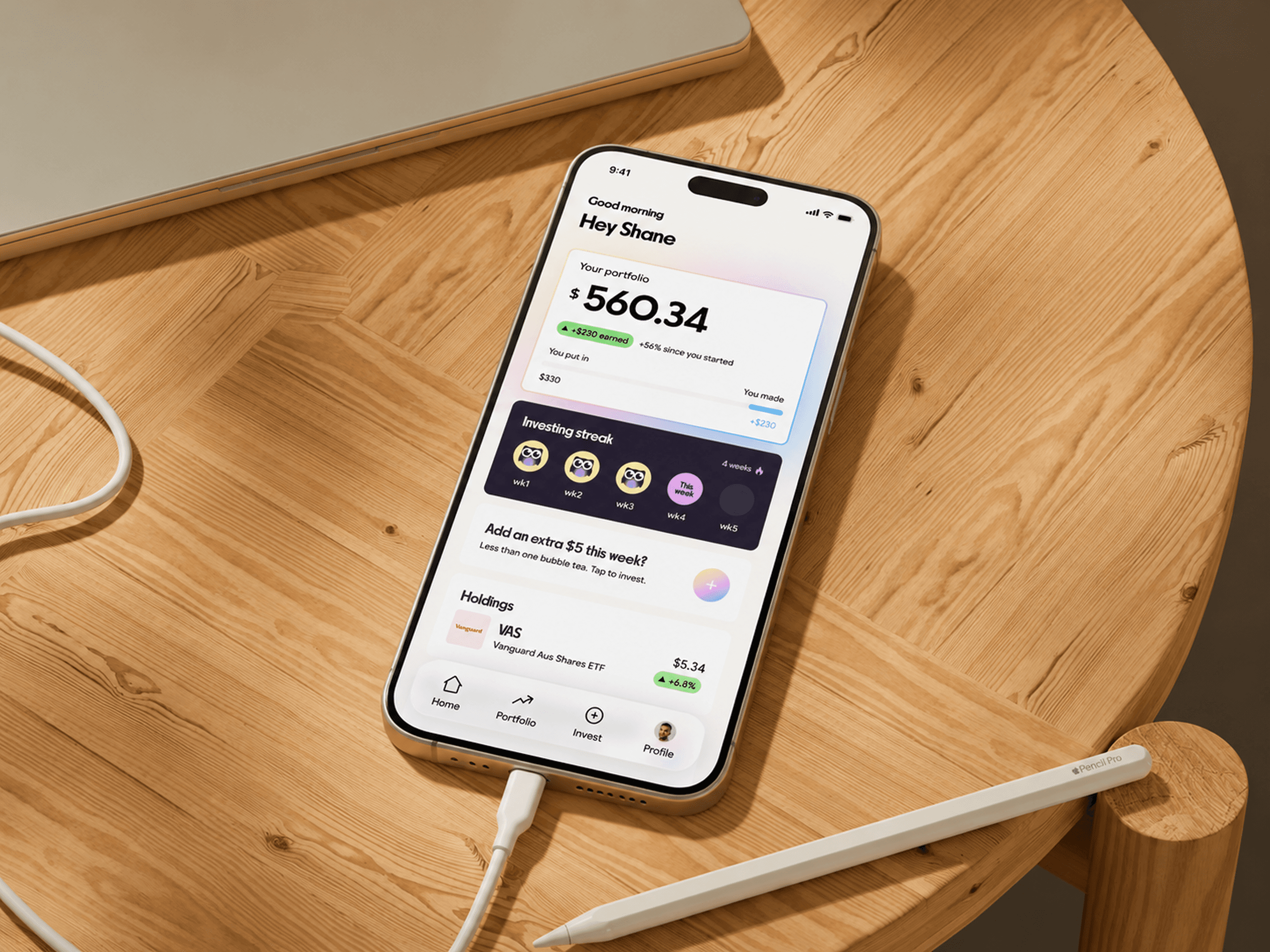
A brand identity and app design concept challenging the idea that investing platforms were built for everyone
Existing investment platforms like CommSec, Stake, and Pearler were designed for experienced investors. Their visual language, dense dashboards, financial jargon, and conservative interfaces signal exclusion before a word is read. 49% of Gen Z say feeling overwhelmed is their biggest barrier. Gen Z believe they need $18,283 on average just to start.
If design created the barrier, design can remove it. Fern rejects the visual conventions of traditional finance and builds from the ground up for someone starting from zero. No assumed knowledge, no minimum capital, no jargon. Every decision was made to lower the barrier to entry, not just aesthetically but culturally.
A full brand identity and eleven-screen app prototype built for a first-time investor. An owl mascot representing observation before action. A purple gradient system that stands apart from every existing platform in the market. A $5 entry point framed as one coffee, a weekly streak to build habit, and a built-in guide replacing the financial adviser most young Australians cannot afford.


