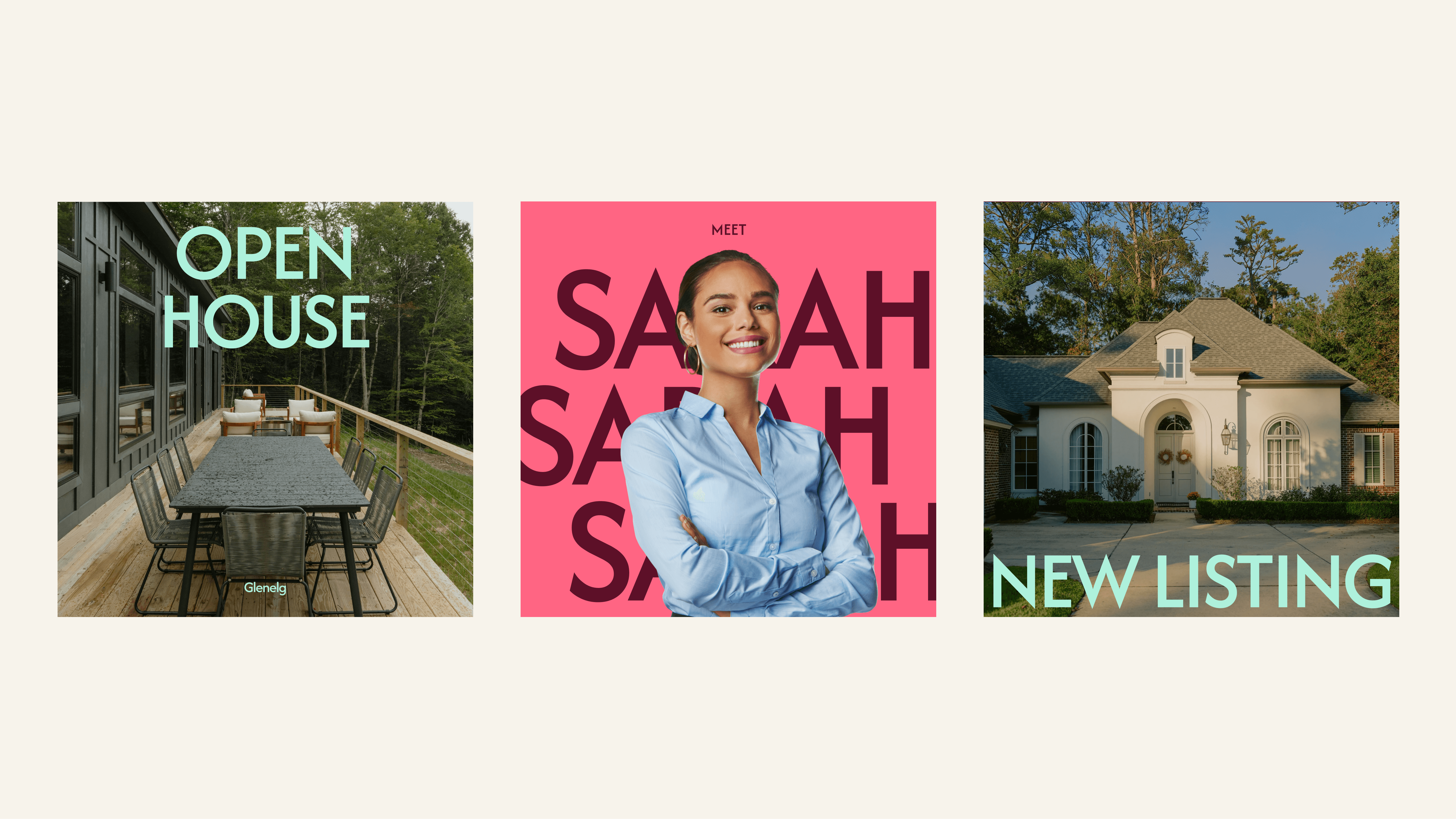
1840 is a boutique real estate agency in Adelaide. I led a full rebrand away from their previous identity, which relied on a bold gold slab-serif logo and a stacked "REAL ESTATE" label. I redrew the numerals in a light, geometric sans-serif with open counters, dropped the underline rule, and replaced the generic category label with "Adelaide's Boutique Agency", positioning the agency around its name rather than its industry. The new system uses a bold multi-color palette to differentiate listings and campaigns, paired with a modern typeface. I carried it through business cards, open-home A-frame signage, quarterly listing templates, agent profile social posts, and the agency's website.
Brand Identity
Logo Design
Web Design
Signage
Templates
 Resume